The Ultimate Trash Bible
The ultimate trash bible is a data visualization of Instagram@stoopnyc 4/1-4/8’s post feed to visualize what New Yorkers are dumping on their curbs. The project aims to create an alternative understanding of New Yorker’s life through the personal items and home furniture they throw away.
The project data is sourced from Instagram@stoopnyc 4/1-4/8’s post feed. Post images and related information were scratched by a python program. After a few test runs on using 25 data entries to generate classification rubrics, the dataset was further cleaned up and paired up with additional datasets.

Based on classification rubrics, a set of icons are illustrated to make the visualization unique to its data source. The icons are the New York subway system, household income, rodent sighting, located neighborhood, located borough, category of the item.
For each category, the icon is inspired by the entries, and each borough’s color palette references back to NY city’s flag.


To achieve the most effective and intuitive data visualization within the limitation of the printer, there were several experiments around how to layout the contents on pages and the construction of the book.
The initial concept was to use paper cut-throughs to incorporate information from both sides of the paper. However, the school’s printer has limited ability to produce zero offset double prints. The folding materiality of paper was then utilized to create an overprint effect with single-sided print.

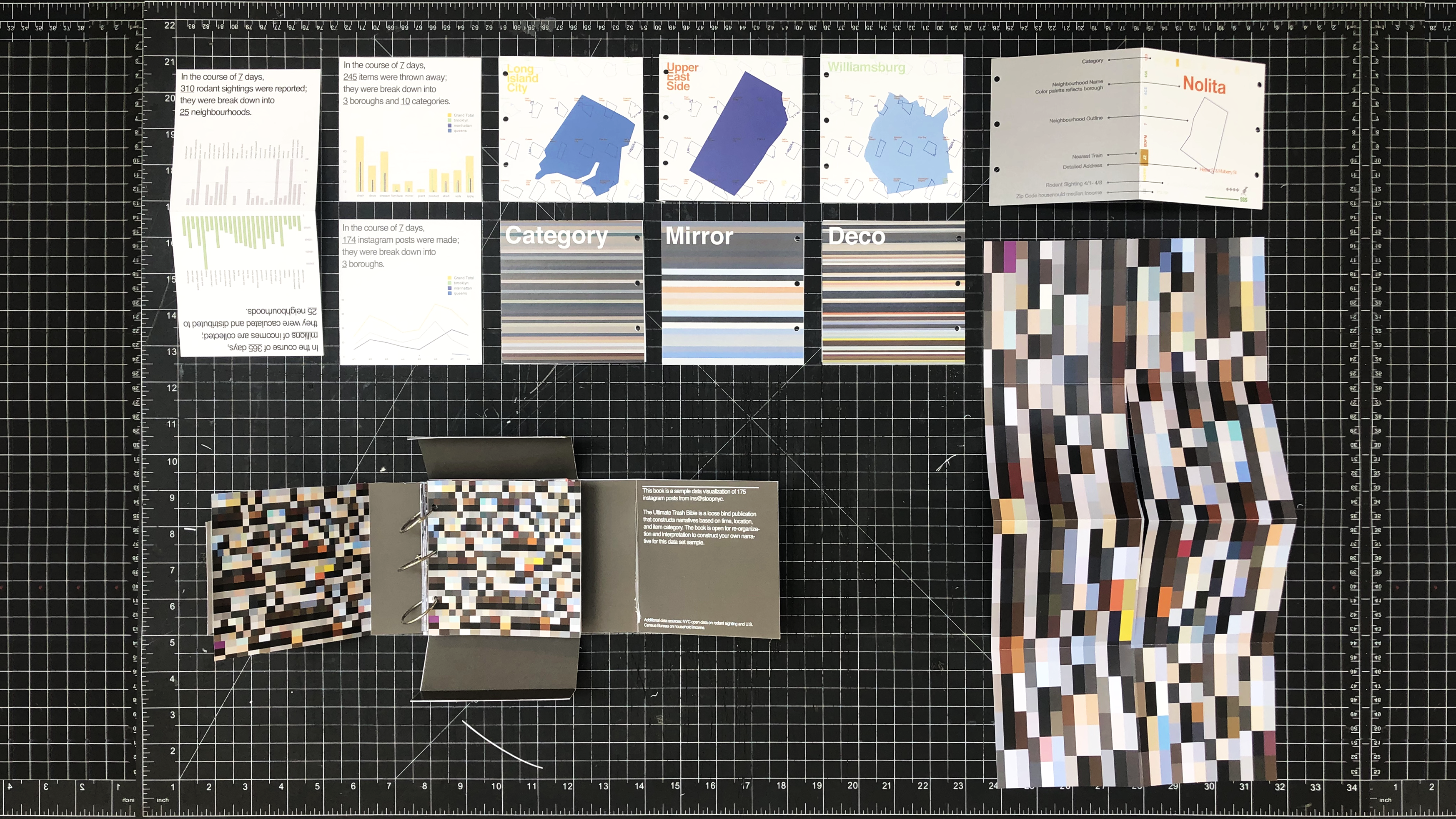
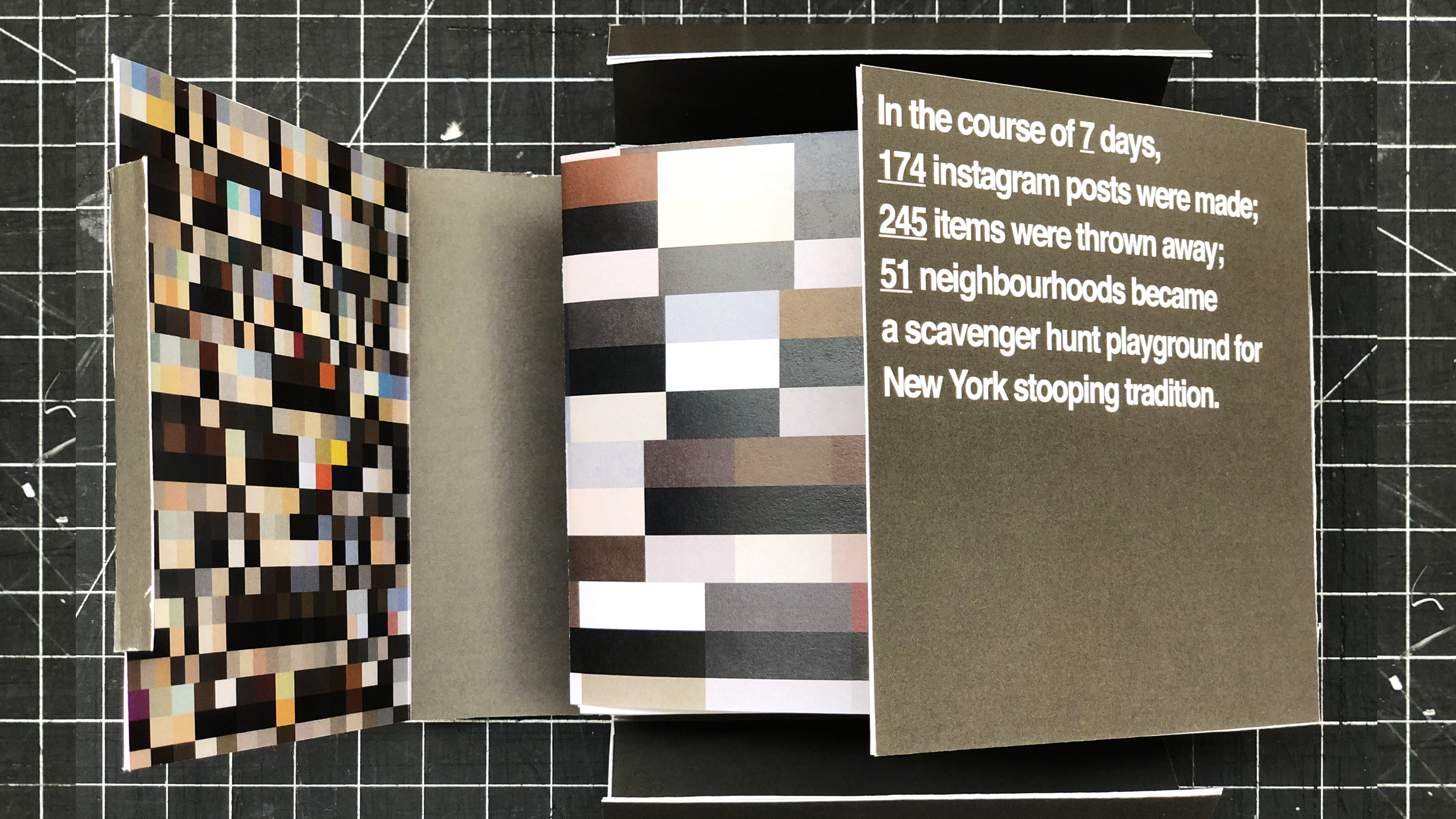
The ultimate trash bible is a loose bind publication that constructs narrative based on transportation, location, and item cate- gory. The book is open for re-organization and interpretation to create your narrative for the data set.
There is 3 pre-established organization method: subway transportation, neighbourhood, and item category. Information graphic cards are enclosed to help the users to form a quick overall understanding of the dataset.
The project has printed a section of the data set to illustrate the visualization output. The content includes sample entries from the rest of the data set.

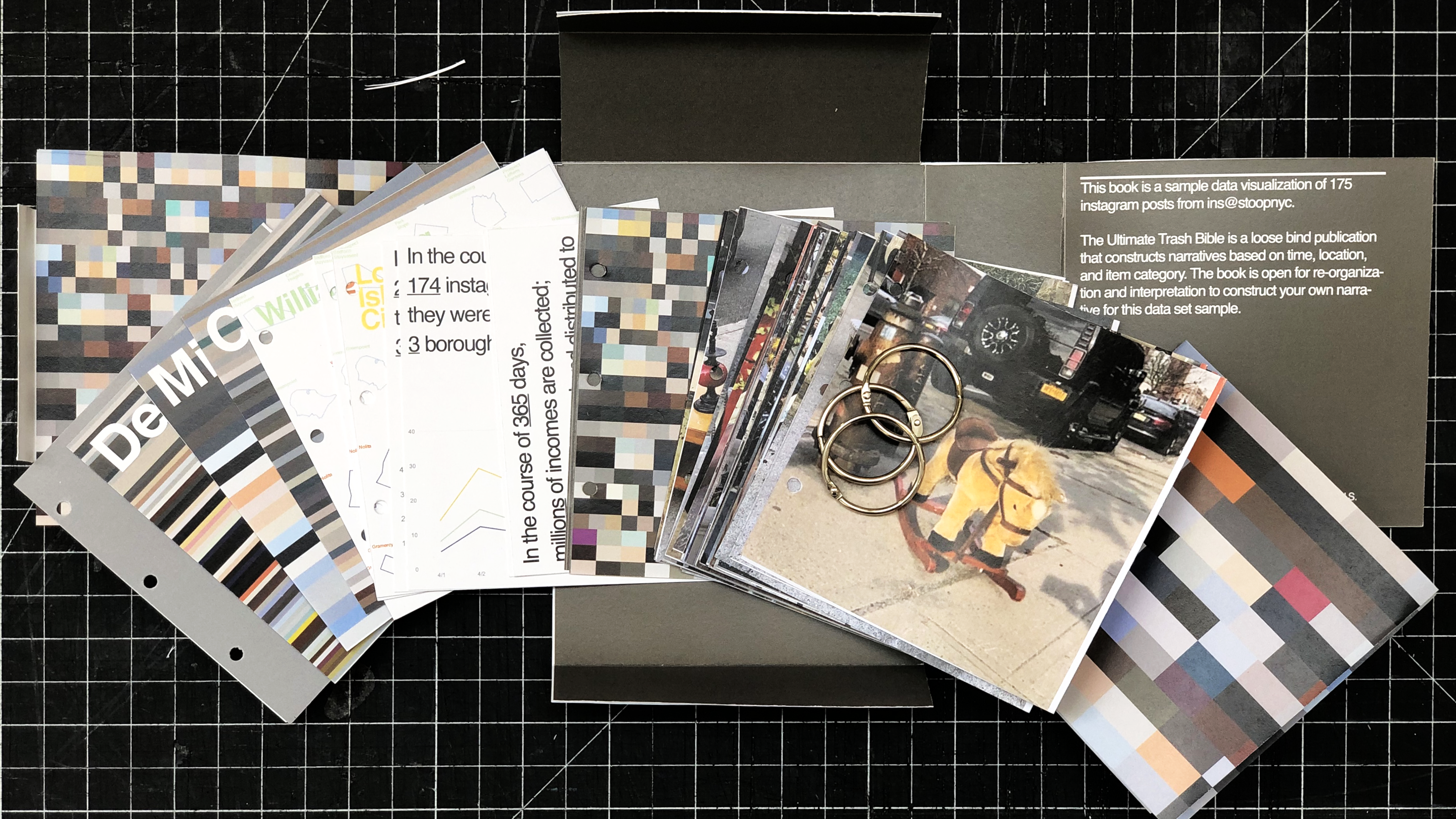
All the contents and accessories are packed in a paper box. The box is constructed to offer some basic introduction of the project and dataset.
The cover image is generated through a python script, abstracting 3 colors from the entire dataset’s entry and organizing according to time.
